Managing Categories & Points of Interest at Attractions.io

Project Overview
Connect is a software tool used by customers to manage the content of their attraction's guest-facing app, specifically handling Points of Interest (POIs) and categories. This project focused on addressing common usability pain points and customer feedback regarding the setup and management of POIs and categories. The main challenge was to enable users to manage their categories without the need for engineering support and to ensure efficient management of POIs.
My Role
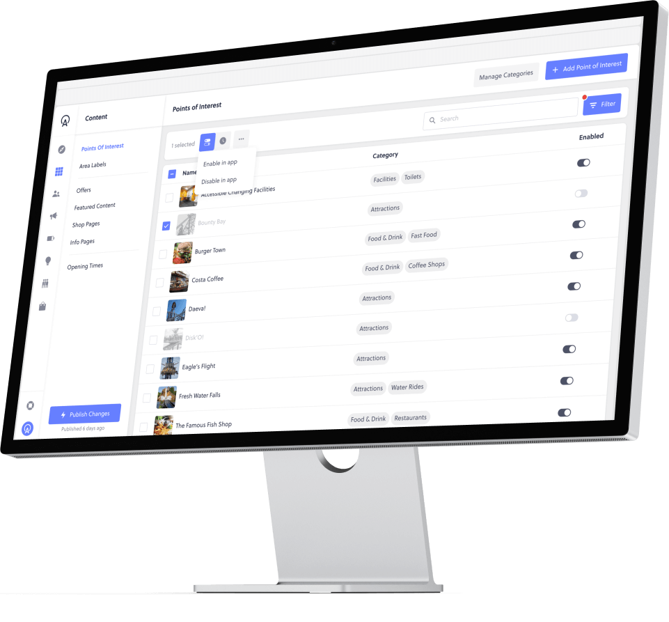
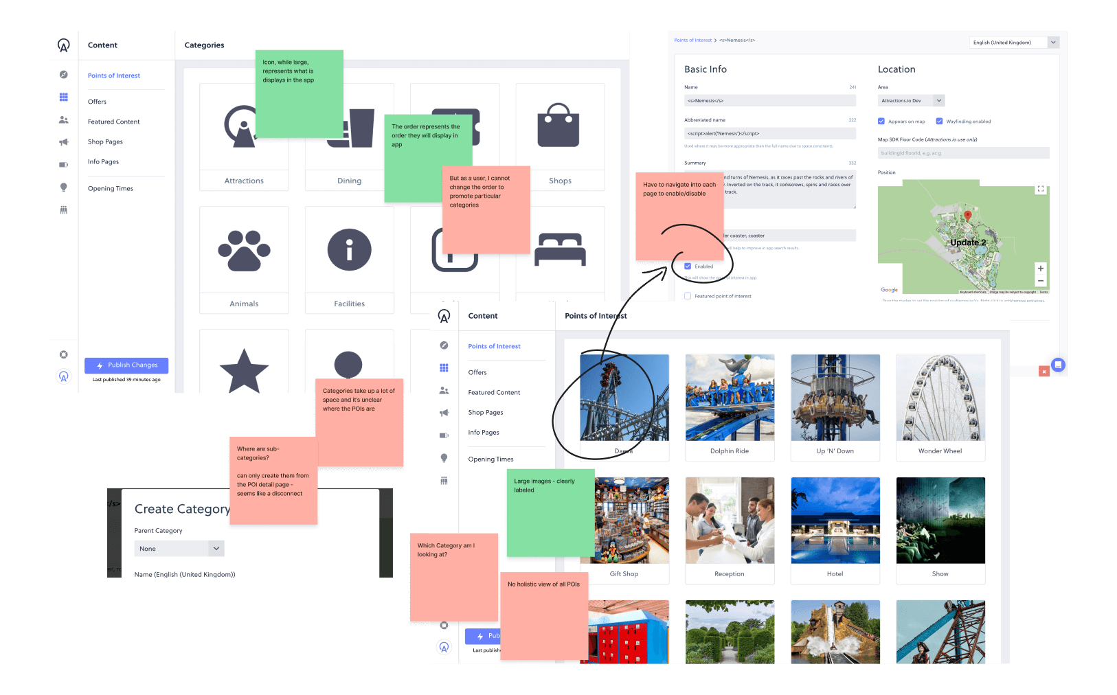
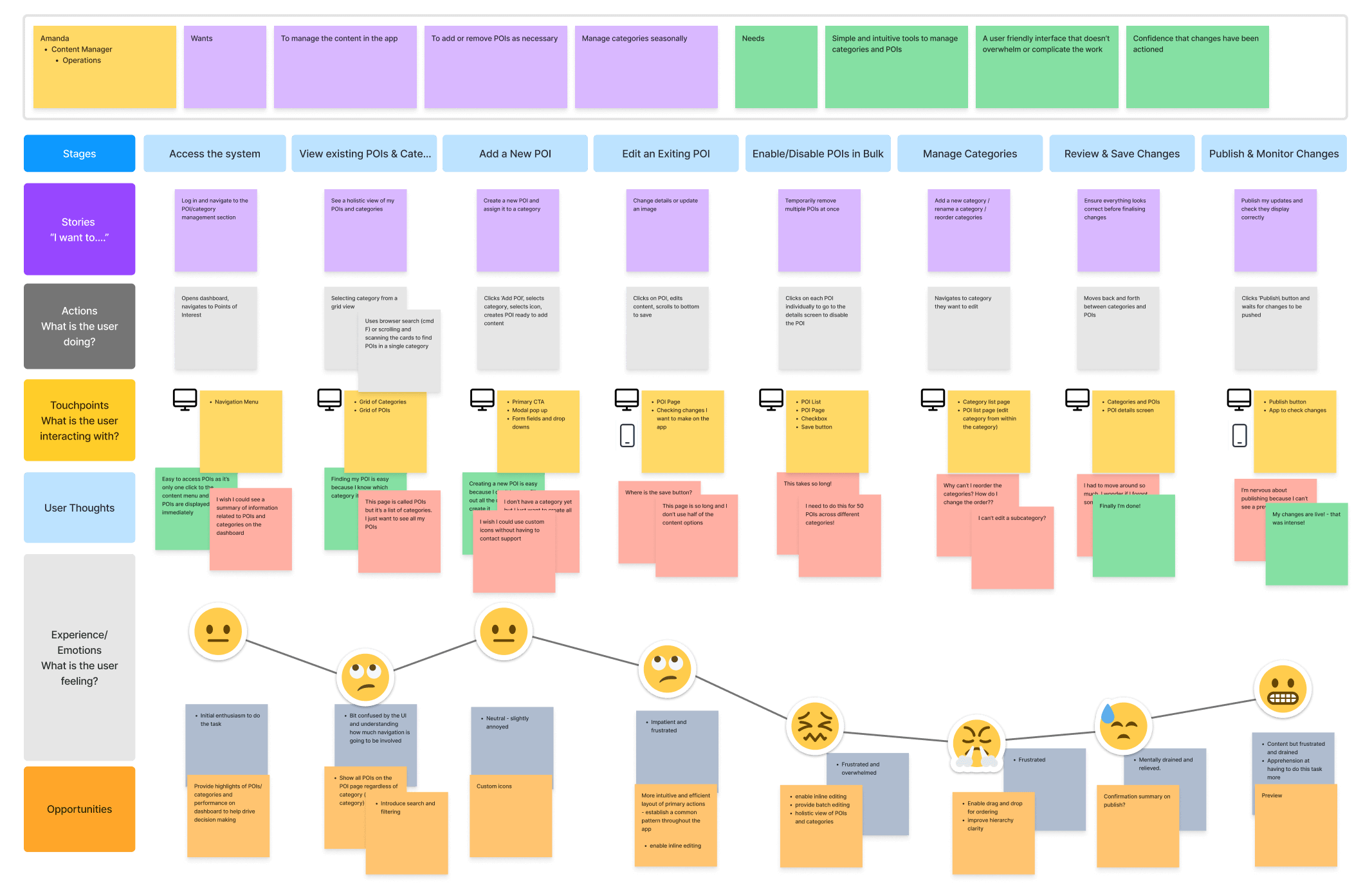
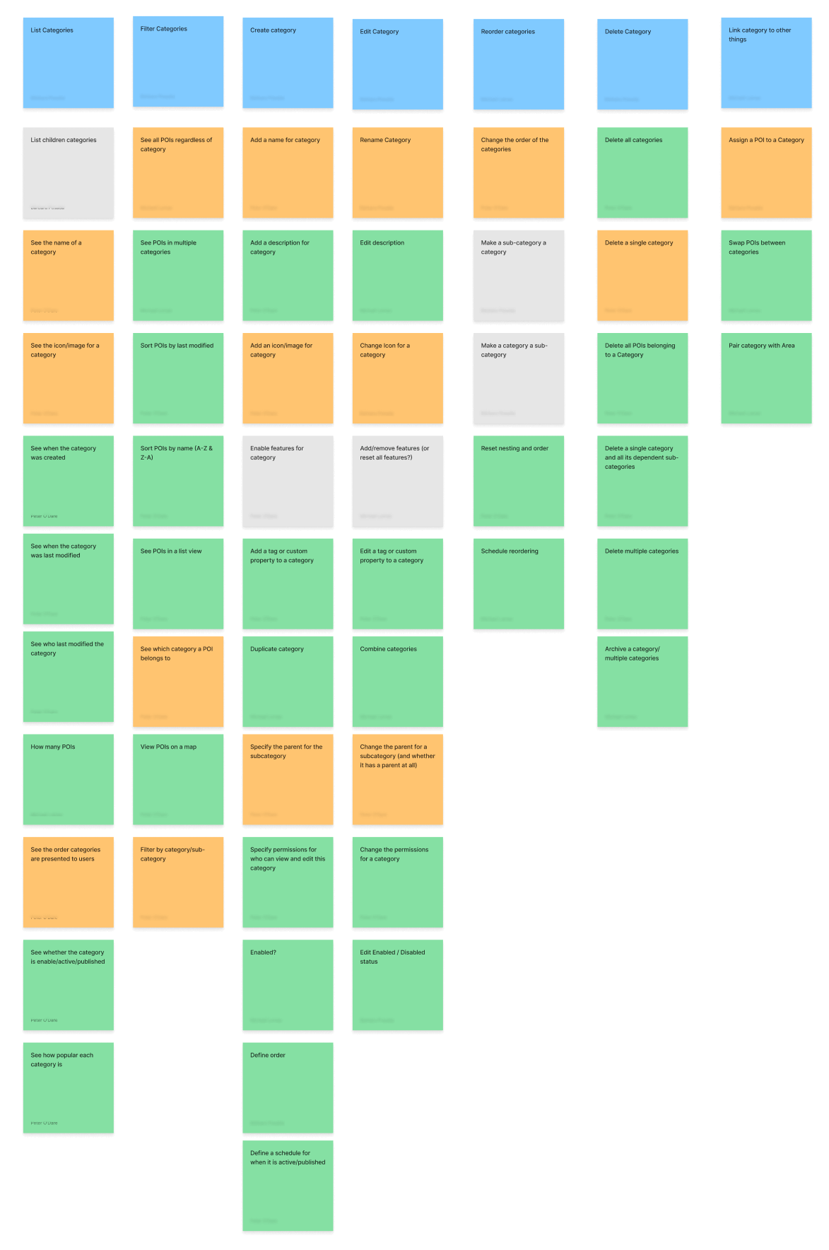
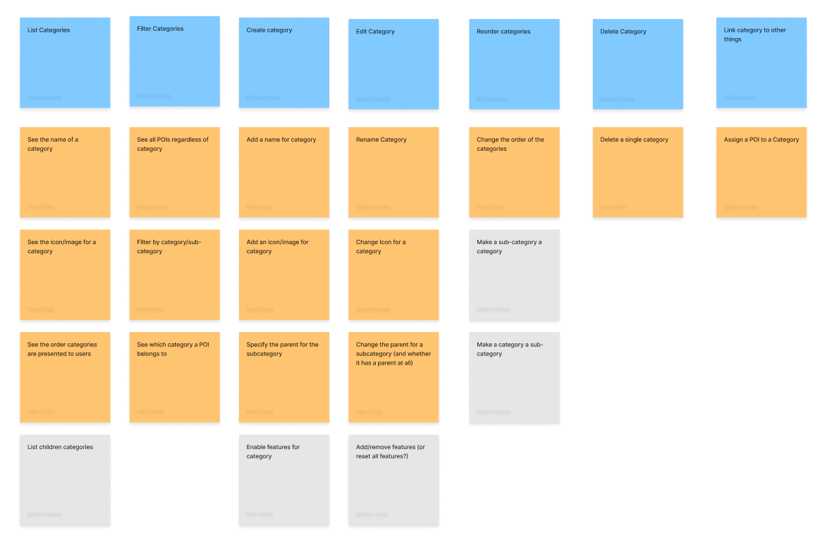
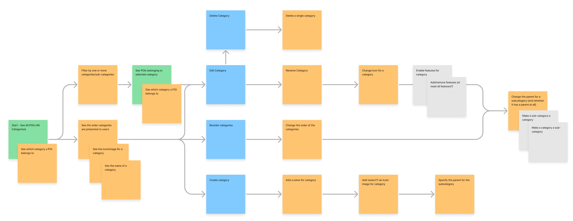
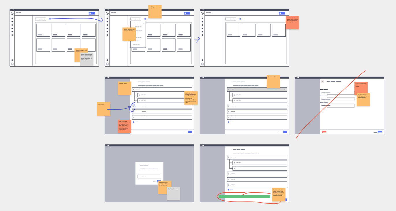
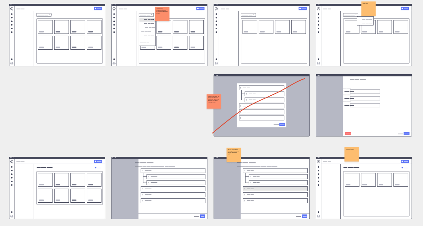
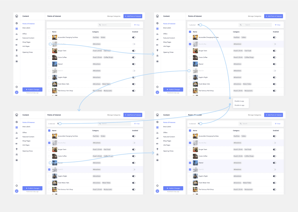
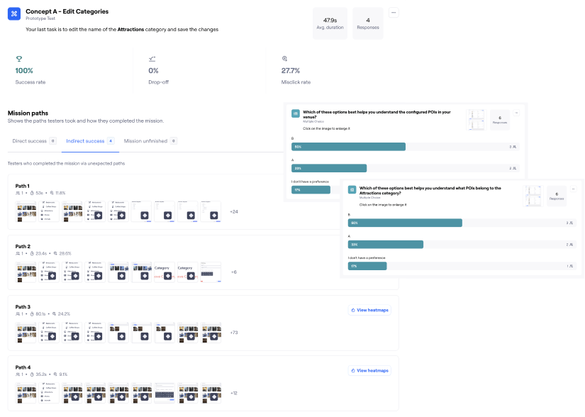
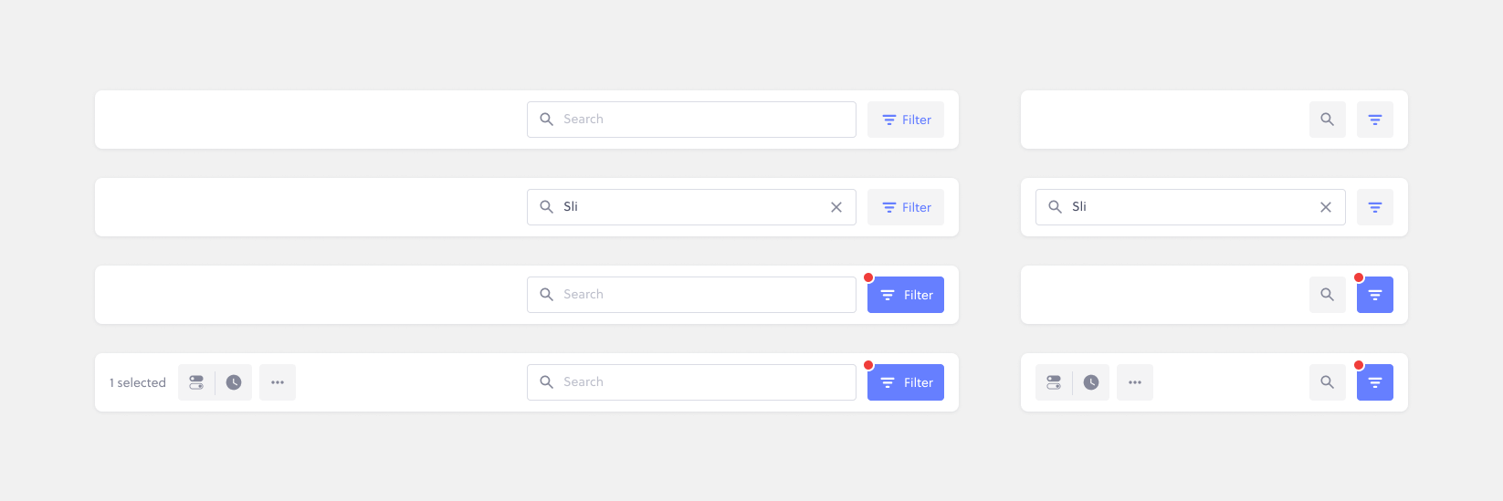
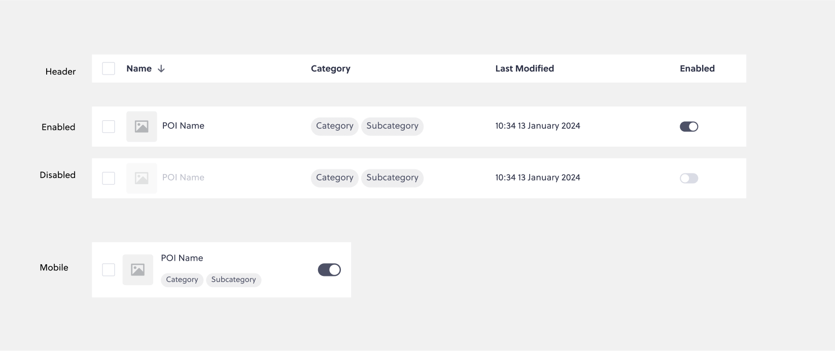
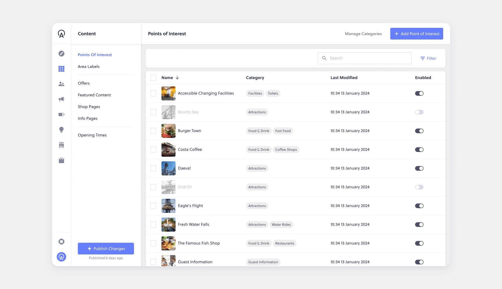
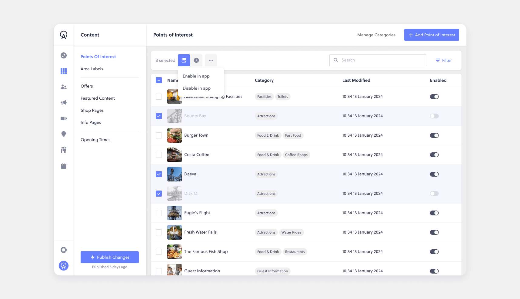
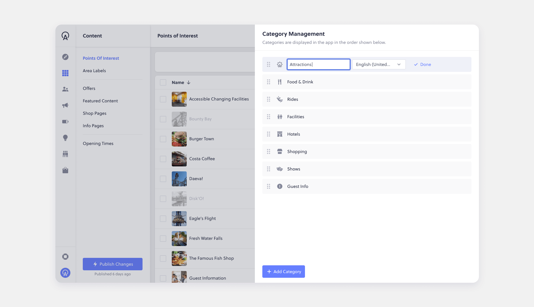
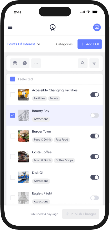
As the Product Designer, my role involved collaborating closely with product managers, engineers, and stakeholders such as customer success and support teams. I was responsible for conducting user research, ideating design solutions, and creating prototypes for validation. Additionally, I worked alongside engineers to ensure the design was scalable, flexible, and consistent with existing patterns used across the platform. This project was iterative, with multiple rounds of customer feedback and design adjustments, ultimately resulting in a more intuitive, self-service solution for customers.
Goals & Metrics
Improve the usability of the POI and category management interface.
Increase customer satisfaction by reducing friction in common tasks.
Improving customer engagement and satisfaction through direct feedback.
Research & Analysis
User Research
User research played a critical role in understanding the pain points and needs of different customer groups. We conducted interviews with customers from a variety of attraction types, such as zoos, resorts, and theme parks, as well as analysing support requests and survey feedback, to understand how they managed their POIs and categories.Through the research, several key insights emerged:
  • Subcategories were underutilised: While customers saw value in using subcategories to better organise POIs, the feature was difficult to discover and use, as it was somewhat hidden.
  • Manual POI management was time-consuming: Customers were spending significant time enabling or disabling POIs, but the process required navigating to individual POI detail pages and reloading the interface. This process was not only slow but also frustrating when managing large numbers of POIs.
  • Lack of flexibility: Customers wanted more flexibility to manage their POIs and categories without needing to switch between pages or rely on engineering support.
💬
“I want to move [category] to the top of the list, but I don’t see any way to do that myself.”
💬
"Can we swap the order of the categories? Right now, I have to ask support every time we need to make a change."
💬
"I spend too much time clicking around just to edit POIs. Is there a quicker way to do this?"
💬
“Can I disable an entire category at once instead of having to go through every single POI?”
💬
“Managing POIs on the app is too time-consuming. We need a more efficient way to make bulk changes.”
💬
“Is there a way to sort POIs by category? Right now, finding and editing them takes way too many steps.”
Feature Analysis
As part of the research phase, I spent time analysing the current state of the feature to highlight its strengths, weaknesses, and areas where improvements could be made. This involved:
  • Assessing the Current User Experience: I conducted a deep dive into the existing POI management system, mapping out workflows and identifying friction points in how users enabled, disabled, and managed POIs and categories.
  • Highlighting Pros and Cons: While the system provided a structured approach to managing POIs, it lacked efficiency when handling large volumes, leading to unnecessary navigation and repetitive tasks.
  • Identifying Key Areas for Improvement: I noted that it is difficult for customers managing hundreds of POIs to find what they needed quickly and complete batch operations, such as disable all POIs belonging to a category.
  • Comparing Against Internal Patterns: I reviewed patterns used elsewhere in the platform to ensure any redesign aligned with existing interface conventions, maintaining consistency and reducing cognitive load for users.
This analysis provided a data-backed foundation for the design phase, ensuring that the proposed solutions addressed the most critical pain points while maintaining a seamless user experience.
Experience Mapping
As part of the research phase, I mapped out the user experience using an experience map to capture how users interacted with managing POIs and categories. This helped visualise the entire journey, from accessing the feature to completing key tasks, highlighting pain points, inefficiencies, and opportunities for improvement. It provided a clear framework for identifying where adjustments would have the most impact and ensured that proposed solutions aligned with real user behaviours and needs.
Key Takeaways
The system's complex navigation, lack of batch processing, poor visibility and organisation, absence of intuitive editing (inline & drag-and-drop), and lack of real-time previews create inefficiencies, highlighting the need for a more streamlined, user-friendly, and scalable management experience.
Ideation & Design Process
Story Mapping
During the ideation phase, we explored several possible solutions through story mapping and card sorting exercises to address the identified pain points:
  • A more fluid interaction model where POIs and categories could be managed within the same interface, without the need for users to navigate between different pages.
  • The inclusion of batch operations (e.g., enabling/disabling multiple POIs at once), which would save users time, especially those managing hundreds or thousands of POIs.
  • A search and filter function to make it easier for users to find specific POIs, especially in large datasets.
As a team, we used these exercises to prioritise key features, ensuring we focused on the most impactful improvements. These exercises helped us structure a clear design and development plan, aligning our approach with user needs while maintaining a logical, scalable workflow.
User Journey
Once we had completed the card sorting and story mapping exercises, I was able to create a comprehensive user journey, outlining exactly how our customers would navigate the feature. This detailed flow ensured that every interaction was intuitively and efficiently structured, minimising friction and enabling users to complete tasks with ease.
Wire Framing & User Testing
Several rounds of wire framing and prototyping helped to bring these ideas to life. We tested different layouts and workflows, iterating on the design based on customer feedback. In early testing, we observed that users intuitively understood how to navigate between POI and category management in the same interface, which was a key validation of our approach.
We tested interactive prototypes using Maze, allowing users to complete tasks like enabling/disabling POIs and reordering categories to gather real-world feedback on the usability of our solutions.

After evaluating the test results, it was clear that a table/list view was favoured by users who needed to scan POIs quickly, as it allowed them to take in the information at a glance more effectively than with large tiles. This layout also aligned with existing patterns in the app, where tables were already a familiar interaction style. Additionally, it provided a scalable foundation, making it easier to introduce features like sorting, multi-select actions, and other individual item controls in future iterations.
Design Decisions and Visual Design
To ensure consistency with the broader platform, we adopted the established pattern of an action bar above a data table, which had been successfully used in other areas of the software. This allowed users to perform actions like filtering and enabling/disabling multiple POIs without navigating away from the main screen.
  • Difficulty understanding which day they were viewing.
  • Inability to filter activities effectively, leading to frustration and confusion.
I focused on designing for scalability. The action bar and table layout were built to accommodate both small and large datasets, ensuring the solution would work whether a user had 10 POIs or 1000. The search and filter functions were incorporated directly into the action bar, with clear, easy-to-use controls for finding POIs and categories quickly.
Additionally, I designed for responsive layouts. Given the variety of devices used by our customers, I worked with engineers to ensure that the table and control bar would scale appropriately across different screen sizes, from mobile to desktop.
Testing & Validation
As the design evolved, we continued to validate our solutions through usability testing with customers and we saw an immediate improvement in task completion rates and user satisfaction.
For instance, during post-release user observation using Hotjar, we found that one customer was able to enable or disable 20 POIs in a single session, taking just 2 minutes. Previously, this task could take 5-7 minutes and required multiple page loads, creating significant friction for users. It was also noted that the search & filter functions were being utilised extensively, enabling users to find exactly what they need in just a few key strokes.
Impact & Results
This solution ensured that Butlin's was ready to handle the influx of new activities without sacrificing user satisfaction. Guests provided overwhelmingly positive feedback, and the customer was thrilled with the elegant, quickly delivered solution.
Reflection & Learnings
Despite the success of the project, one key takeaway was the importance of continuous user testing as we neared the development phase. While our early validations were helpful, we learned that more testing closer to the final stages might have caught potential issues with the phased release. In particular, releasing the new UI alongside certain features prematurely caused some usability gaps, which we had to address with a patch.
As a result, we committed to improving our process by engaging more stakeholders throughout the development phase and offering more comprehensive release notes to customers, ensuring clearer communication and a smoother user experience in future updates.
Back to Portfolio